
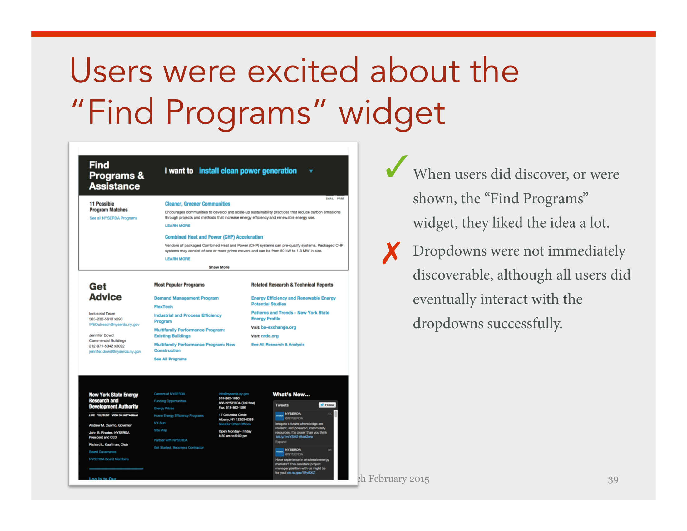
The gist
The New York State Energy Research & Development Authority (NYSERDA) is our state's resource for green energy incentives and initiatives. In fact, New York's aggressive clean energy vision is a beacon among states reaching for sustainable energy reform.
As Principle UX Director I guided the overall design process, produced and presented all user experience artifacts for the responsive redesign of NYSERDA.NY.Gov.
As Art Director I collaborated with a Creative Director and the New York State brand team to create all user experiences and design screens for the sprint 2 / optimization, launched March 2017.
3
months from kick-off to launch
2051
pages of content
4
rounds of user feedback

The ask
NYSERDA had just completed a full website redesign about a year before they hired me to fix it.
When a new senior executive was brought on he asked, Why isn't this freshly designed website responsive? Is this dense, technically-worded content right for all of our users? Why does the design already look dated?
Rather than spend a year or more on another oversized redesign to fix these problems, he contracted my consultancy for a "quick wins fix."
User needs
I'm not one to take things at face value. Over a decade of talking to real users about your work will have that effect.
This is why I pushed back on my client's request to fix NYSERDA's live site. Would the needed updates be too extensive to be a retrofit? Suggesting they scrap the live site would be tricky; because doing so meant asking the internal team who worked so hard on the live site to throw away their work.
So I looked to their users to make my case.
Surveys and interviews indicated information design problems
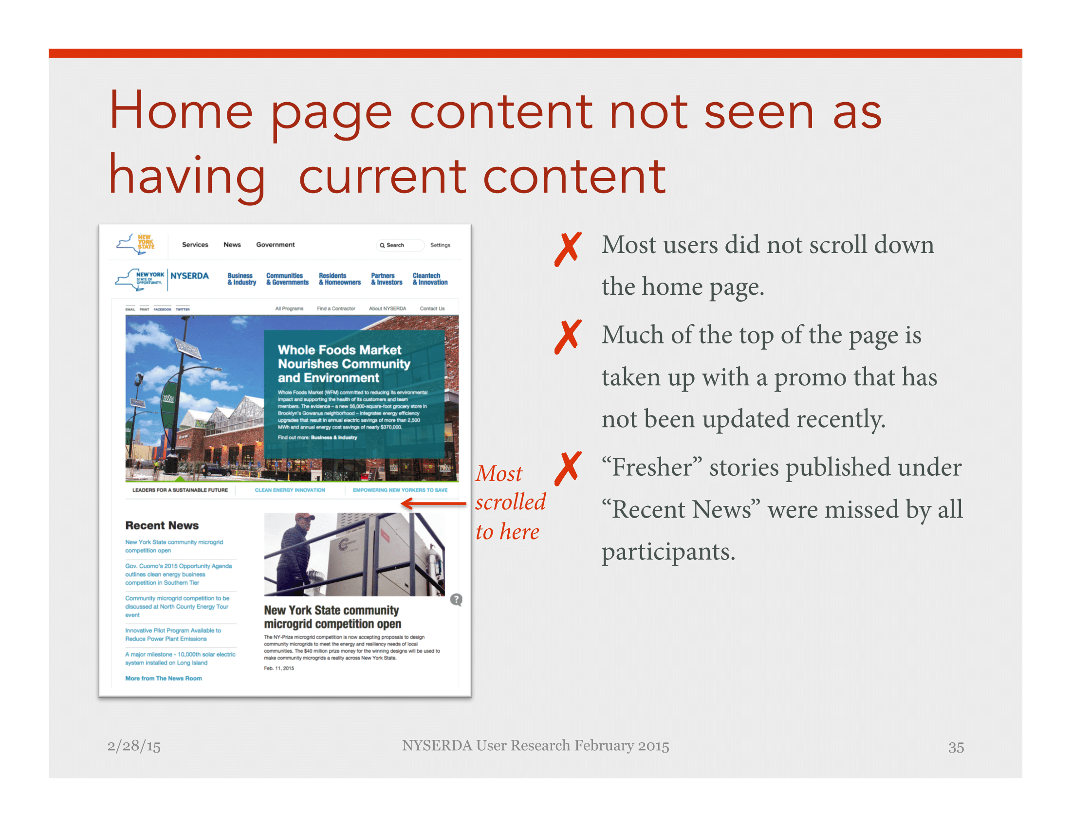
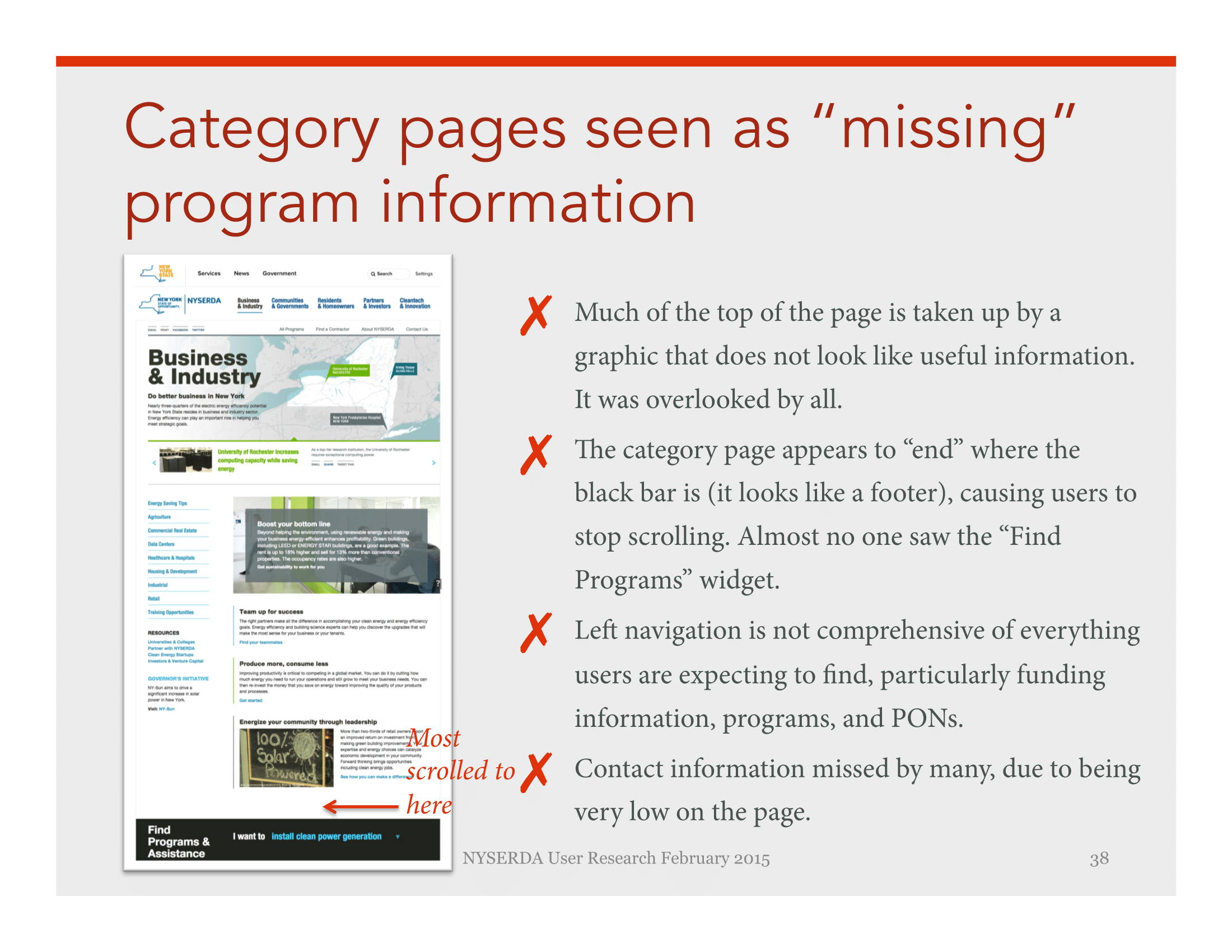
I love to put a blank text box on a survey, asking for users to suggest improvements. Because when 27 out of 61 people volunteer to type, "I can't find what I'm looking for!" you can be pretty sure your information design is a key problem.
User interviews with 17 participants amplified this message: Improve the website's organization and wording.
44%
can't find information
25%
can't understand information
“The site is generally clumsy, hard to navigate and much too technically worded.”
Rather than personas...
Sometimes a client has persona fatigue. NYSERDA fell into this category. Having recently completed 12 painstakingly defined personas, they had no appetite for doing personas again.
That came in handy for me, because I didn't think personas were the right tool for communicating user needs. Here's why. Most of NYSERDA's website users overlap in terms of demographics—college educated, adults, fairly even split between genders. So a persona with these data points wouldn't elucidate anything for an improved new user experience.
What best captures the needs of New Yorkers interested in clean energy? User modes & context.
...user modes.

Decision Makers
Corporate executives or local leaders who are vetting energy proposals made to them by Influencers (see below).
They need proof and reassurance that proposed energy investments will pay off.

Influencers
Researchers and policy makers writing energy proposals aiming to influence Decision Makers.
They are energy wonks who need current research and technical details to write solid proposals.

Residents
Trying to learn about clean energy for their home. They are willing to learn technical terms and do deep research.
They need to know they're making the best investments in home energy upgrades to help the environment and maximize energy savings and rebates.
UX imperative
Reorganize and simplify NYSERDA's website to help citizens make better energy choices and contribute to New York’s energy vision.
New Yorkers interested in clean energy, needed help finding and understanding NYSERDA's programs and initiatives. The real UX innovation here was simply doing the hard work organize their content and design. My client knew what was needed, but needed someone to guide them through the how.
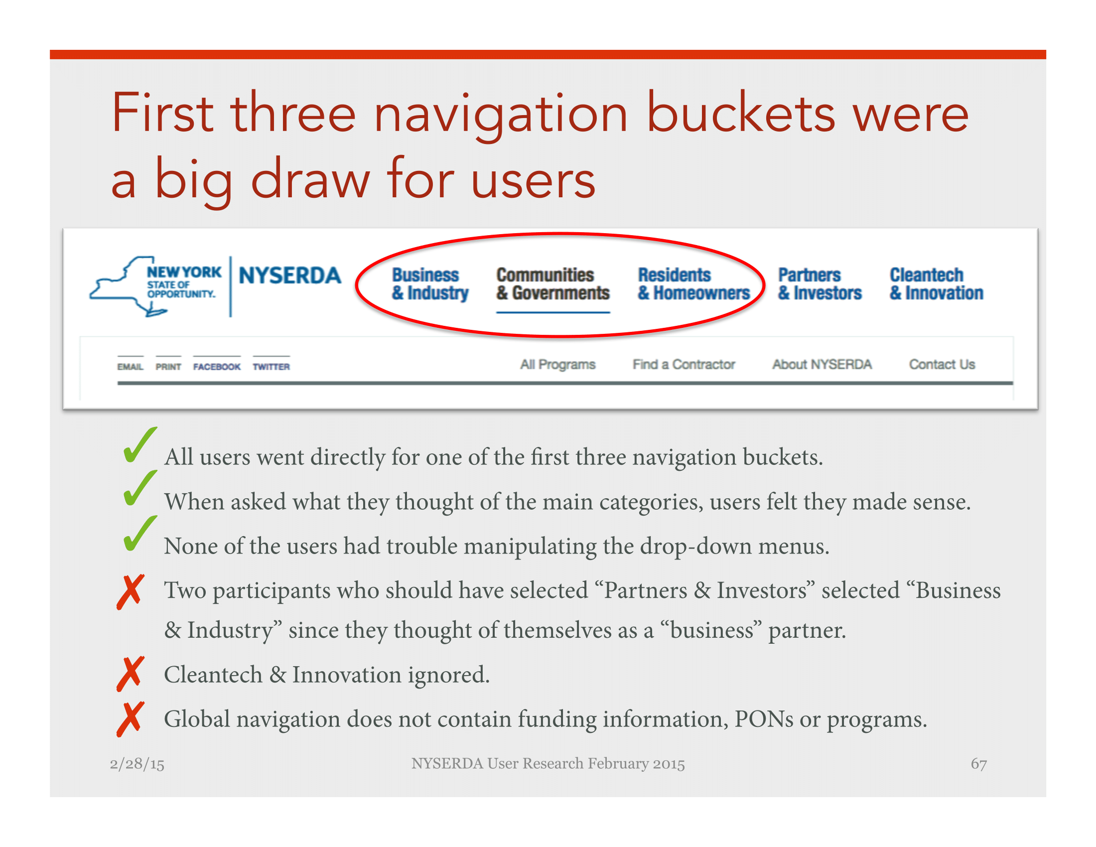
Audience-based navigation
Getting a rebate for your ENERGY STAR dishwasher is a world away from approving a budget for hydrogen fuel cells in a hospital complex. So first thing, I sketched a new audience-based navigation that recognized the differences in our visitors' context or energy market.

1. Navigation before my redesign reflects the internal organization of NYSERDA.

2. My early sketch of audience-based navigation reflects needs of users from different energy markets

3. Wireframe of navigation shows one version of the ever-changing categories and labels

4. Final Navigation after user testing and Subject Matter Expert review
Content strategy
Once the primary organizing principle was agreed upon, we needed to re-map 2051 pages of content onto the new structure.
Weeding out content ROT
Before reorganizing things, I wanted to make sure we were only publishing quality content. I led the effort to remove all Redundant/Outdated/Trivial content. With the support of client-side subject matter experts, our ROT analysis reduced the site from 2051 to 1092 pages.
That's right. About 47% of the old website content was Redundant, Outdated, or Trivial. No wonder users were getting lost!
Content mapping + production
Fun fact for content strategy nerds: my ROT matrix had 4 lives.
- It started as a content audit...
- ...on which we documented our ROT analysis.
- The ROT matrix then became our full content map, with good-to-go content mapped to our new information hierarchy.
- Finally, content gaps were identified on the content plan and became our content production matrix.
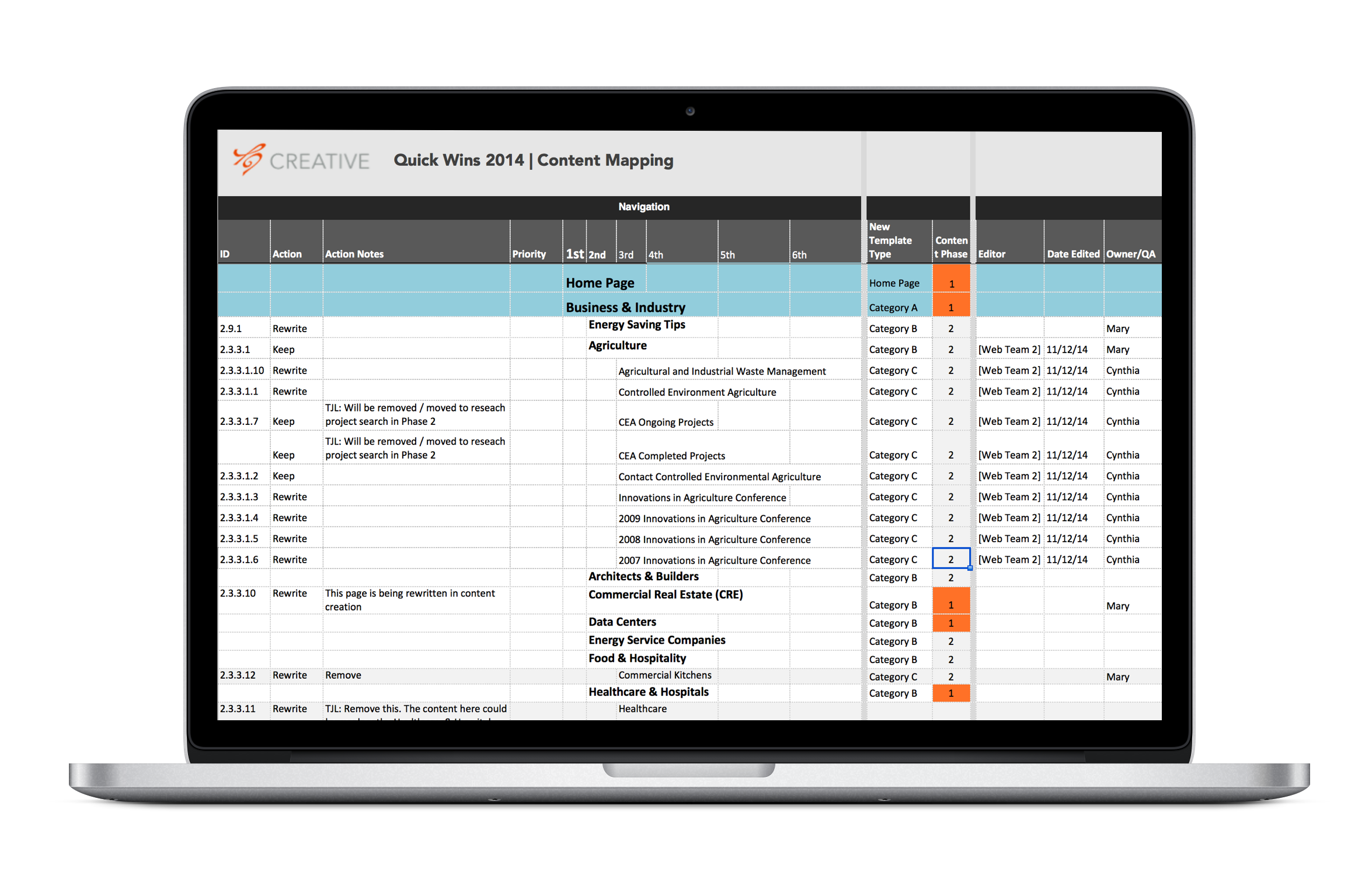
I ❤ giant spreadsheets. The content mapping matrix was core in reoganizing NYSERDA's 2051 page website.
User interface design
Even after eliminating about half of the site's content, the interface had to work hard to help users narrow down the remaining 1000+ pages.
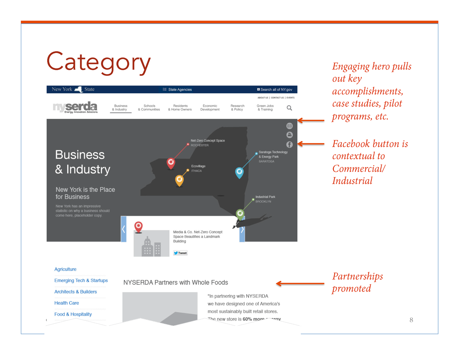
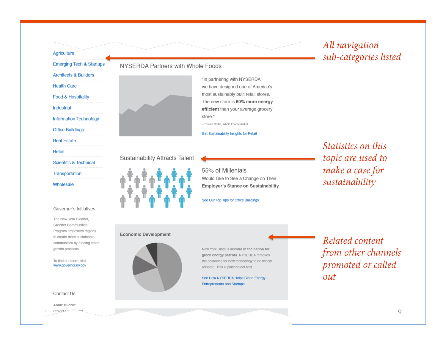
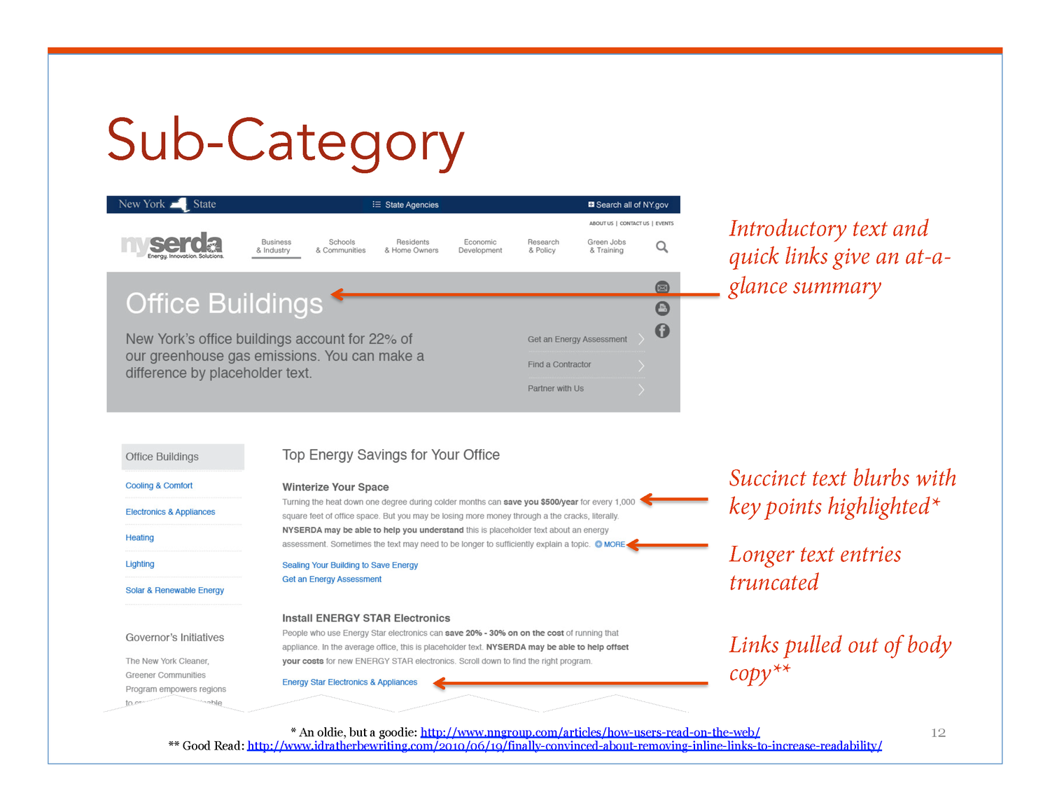
When a user enters the site section for her energy market, she's at the widest part of the information funnel. For bigger markets like Business & Industry sub-markets, like Agriculture or Manufacturing, help the user further narrow down the content.
At the same time, general content about each market, or sub-market helps the user discover clean energy incentives and initiatives she may not have known about.
First draft of templates
category (energy market), subcategory and topic


A new, new site
It turns out that asking NYSERDA to scrap their live site was not tricky at all.
Most users could not find what they work looking for and almost half of the site's content was ROT. The need for a new, new site was clear.
Production Time
If you've ever read the novel Snow Crash, you'll appreciate the quote, "--after that it's just a chase scene." For this part of the case study, I felt like writing, "after that it's just making the thing."
It's funny because, just like the chase scene, making the thing really is the climax of the work. But at the same time, you know what comes next. You know how chase scenes go.
Our chase scene went like this.
In close collaboration with my project team I led the scoping, batching, rolling delivery, daily stand-ups and QA calls for all design sprints. Special thanks to Matthew Abate, my contract Creative Director, who rocked the brand and creative for Release 1. And of course thanks to my client and their production partner, MindShift, who delivered on every promise they made to me. #dreamteam
“[Tobi Jo] is hard-working and dedicated and will do whatever it takes to get the job done.”
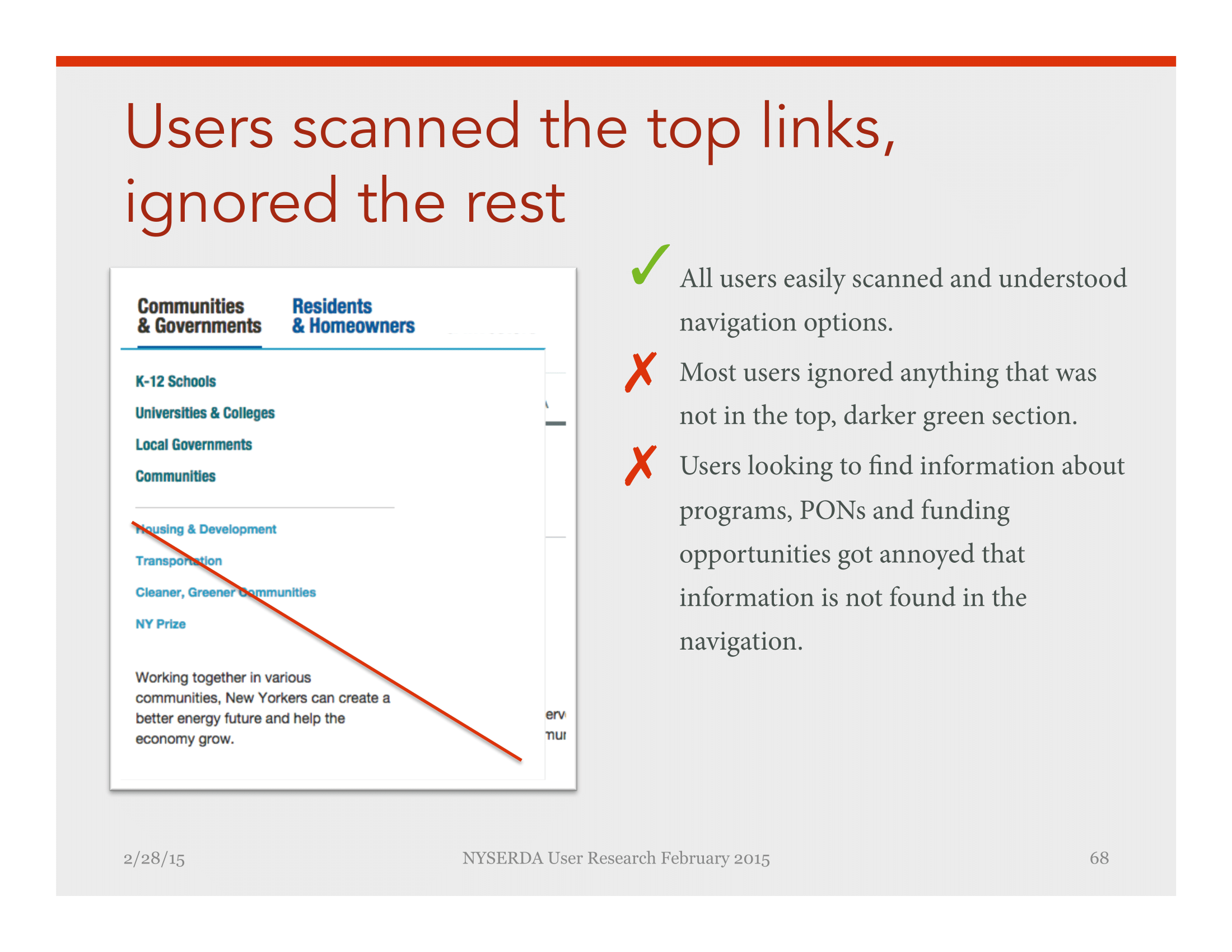
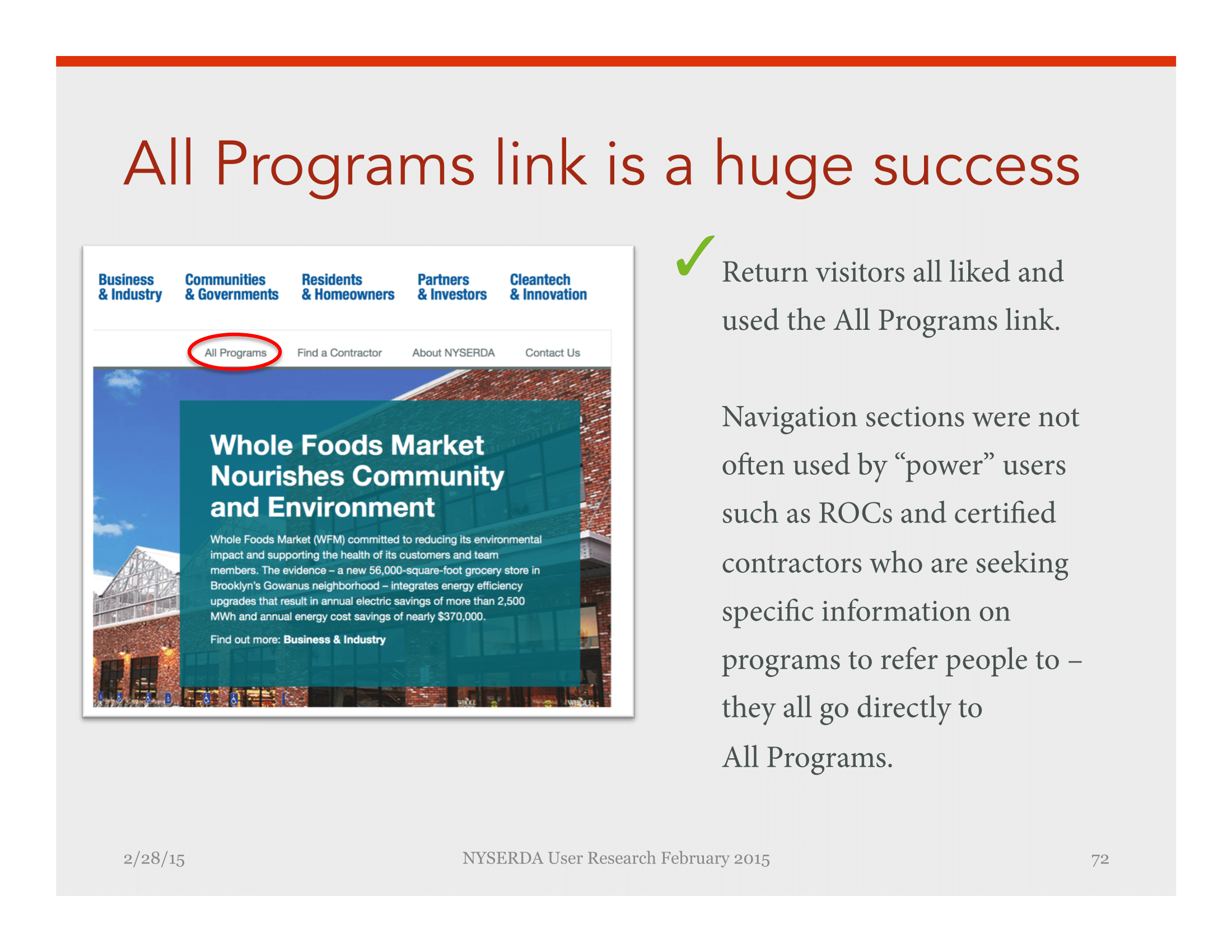
Usability testing
I like to test ideas early and often. We started with exploratory interviews and surveys. A few weeks later it was time to test Release 1 with users.
I led remote usability tests with an external moderator, Nicole Rubin, to lower any potential bias from moderating my own tests. Below are select screens from the full report.


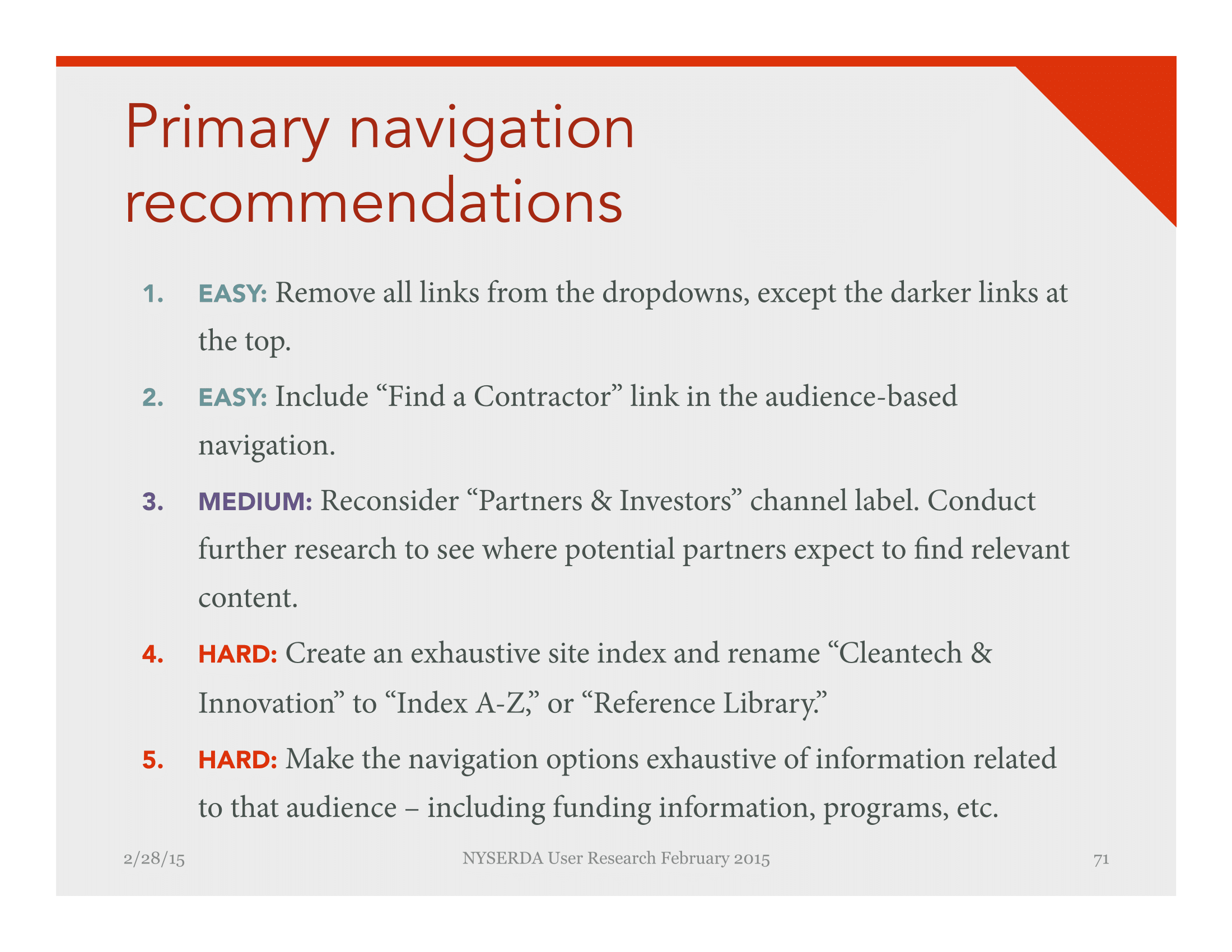

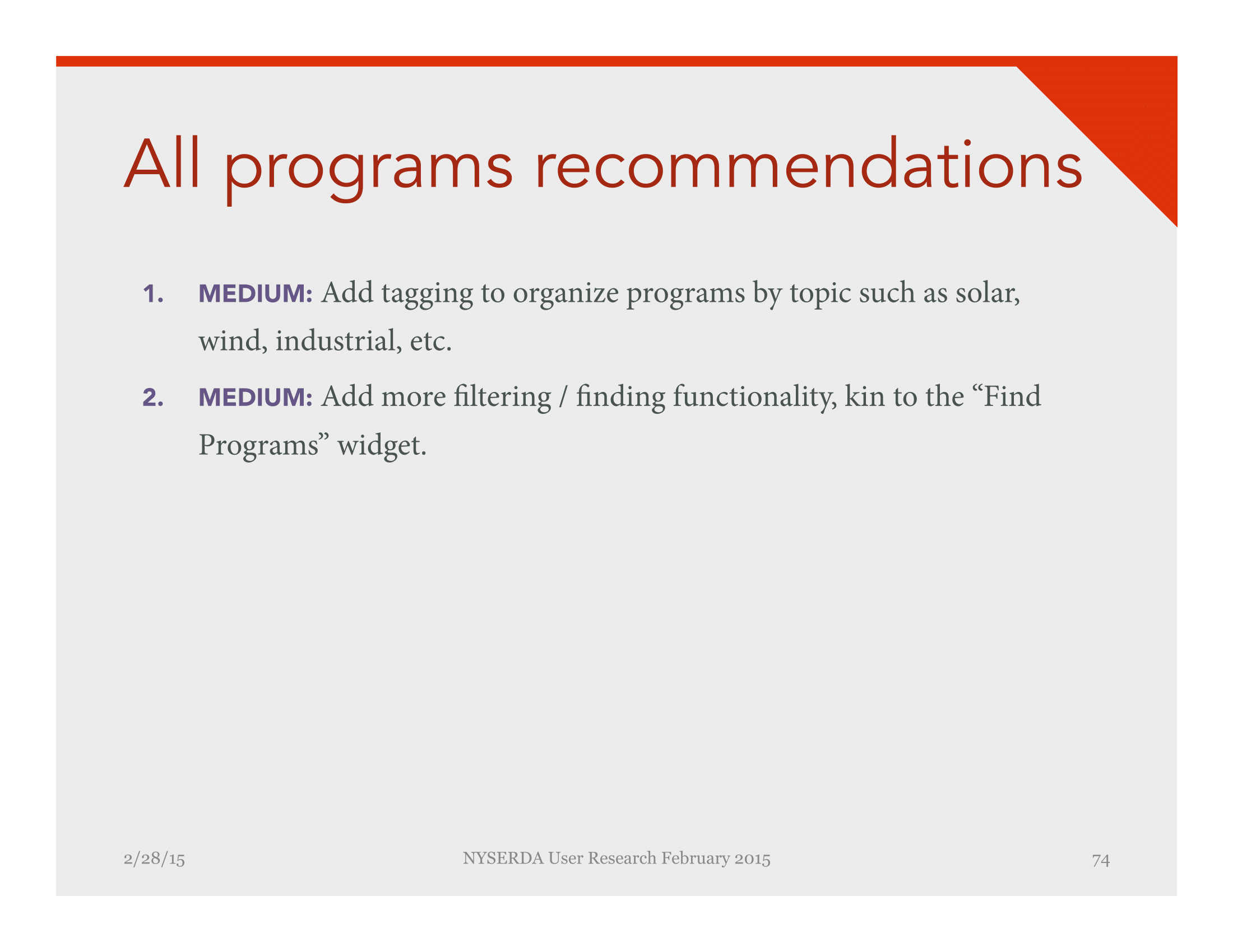

With our user research results in hand, I led my client through a series of workshops to define our Release 2 priorities.
Prioritization criteria:
- User needs: adding a persistent user feedback widget (UserVoice), improving the navigation, and appealing to NYS to change the duplicate header
- Business goals: new templates to replace program microsites
- Organizational: staffing an Editor in Chief to keep up efforts in simplifying the content
- Level of effort: how much time would an enhancement or fix take to design, build and maintain?
Optimization
Not too long after Release 1, NY.Gov released a brand book and digital design guidelines for all state entities to follow.
I designed the UX and creative for all Release 2 screens, incorporating the new NY.Gov guidelines.
Release 2, launched in March 2017 and included navigation updates, new microsite templates and mobile enhancements.
Mobile navigation fixes.As of November 2016, the live site was a less than optimal mash-up of the original design and new NYS digital guidelines.
An updated version simplifies the design language and interaction.
The result
After qualitative testing and optimization, NYSERDA's reorganized site has simplified the path to finding relevant content.
Before the redesign, people visiting NYSERDA.NY.Gov got lost endlessly clicking around, trying to find relevant content. Users tried their best to understand dense, jargon-filled program names and content. The re-envisioned site organizes content by energy markets, bringing the user down an information funnel from high level topics in a user-friendly way.
KPI: Increase traffic to content pages
Comparing 2013 and 2015, NYSERDA saw 25% increase in content pages viewed within two clicks from the home page.
